How subtlely rebranding can keep your company identity
As any company (big or small) moves forward and grows, it's inevitable that at some point they will want to update their corporate image to match the times. There are a huge number of reasons to rebrand - brand awareness measures pointing to the need, a changing aesthetic in your industry, new owners wanting to take control of a business, or just the evolution of the business and people within it. Whatever the reason for the update, it's possible (and often important) to take that dramatic step forward without losing the 'essence' of your existing brand.
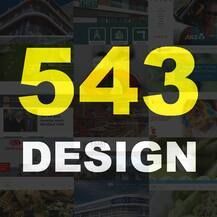
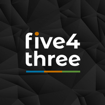
For 543 Design, that desire to take a step forward came upon us (again!) recently. When we first started the company our brand wasn't something we put a huge amount of thought into. We were so focused on getting out and creating other companies websites and logos that our own image sat idle for years. In year one we quickly jumped away from the 'Pak n Save' yellow and black which got us off the ground, and picked up a more vibrant orange, blue and green colour scheme to pop off the screen a bit more. Over time, that scheme and logo got paired with the geometric patterns you see behind the website menu today, and now we're proud to launch a more refined logo that we feel represents us far more elegantly. Just as we've evolved as a business, our brand has evolved. The logo you see live on the site now focuses on the simple, clean and bold aesthetic we like most in our website designs, while keeping the blue, orange and green that is so much the 'personality' of 543. We love a splash of colour and we're not a boring outfit, but it's really pleasing to represent the brand in a much more refined fashion.
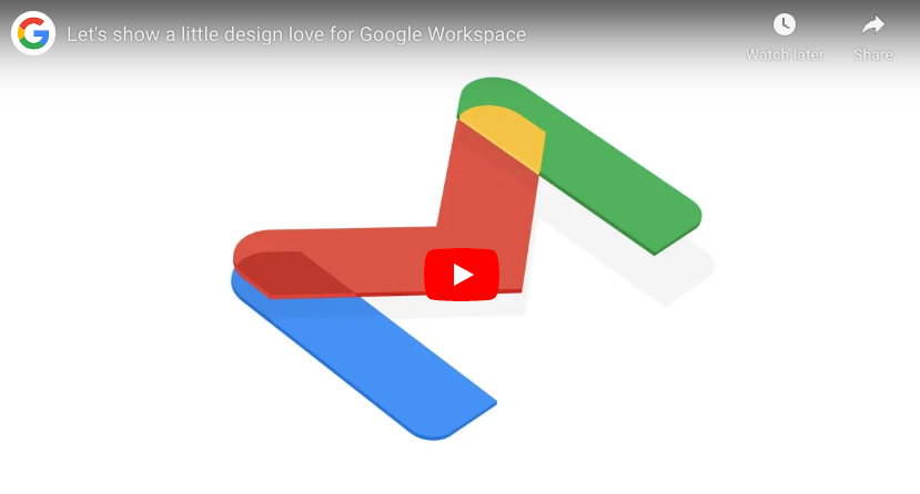
We're not the only company that has been going through a changing image this last couple of months. Gmail has also seen it's iconic red envelope evolve as well - moving in line with the other core Google colours. The online behemoth originally considered dropping the Gmail logo all together, but their user research showed that people had an affinity with that envelope and pushed back against getting rid of it completely - so the logo has simply evolved. Below is a little video just paying homage to the design that has gone into both that logo and the rest of Google's new 'Workspace' and it really goes to show that a little design thought and subtlety can both spruce up and unify a brand.
Ultimately, whether you want to 'rebrand' or evolve your brand is up to you. For some, a wholesale change with new fonts, colours and icons may be the way to go...but for us, there's something quite special about taking an existing brand identity that you already love, and evolving it into something even more special.
As always, if you do want to rebrand, or have any questions about logo design, branding or anything else in the design space, don't hesitate to drop us a line.